
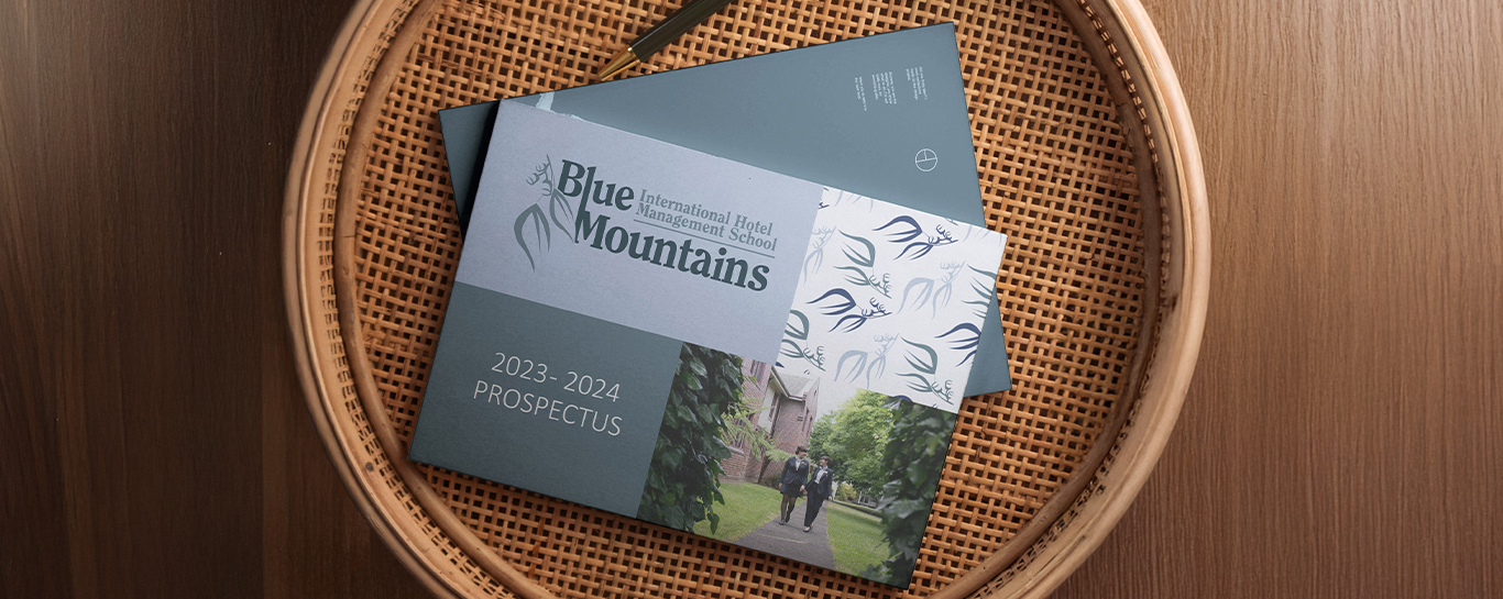
As part of a university design project, I was tasked with rebranding an established educational institution. The brief required the development of a new lettermark and supporting graphical elements — including patterns and iconography — that could be applied across a wide range of scenarios. Branding guidelines were also to be created, along with a suite of real-world applications such as a prospectus, signage, posters, and social media graphics.

Working independently, I completed all aspects of the brand development — from conceptualisation to final application. This included designing the core visual identity, icon system, pattern library, and the full brand rollout across key collateral, ensuring consistency and versatility throughout.
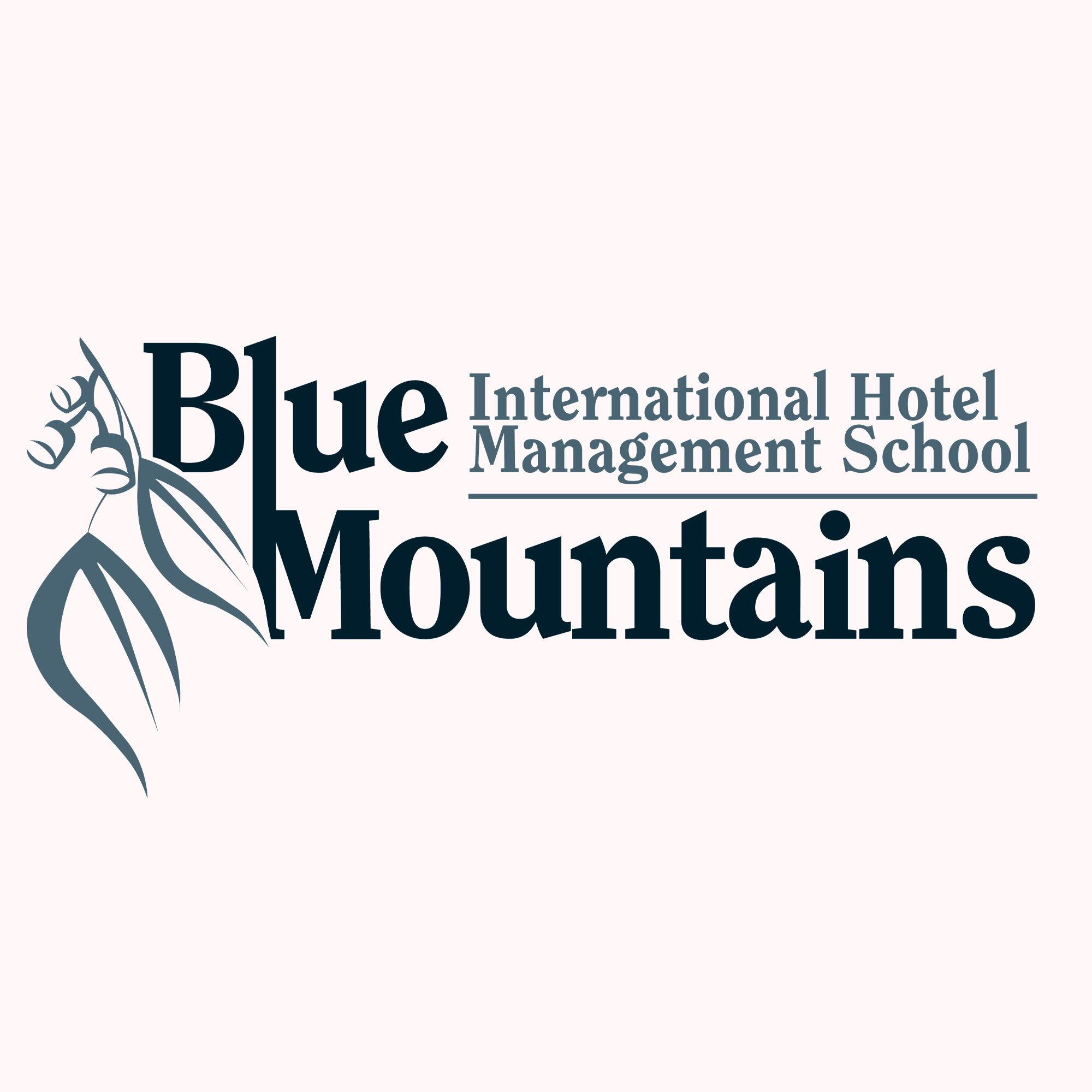
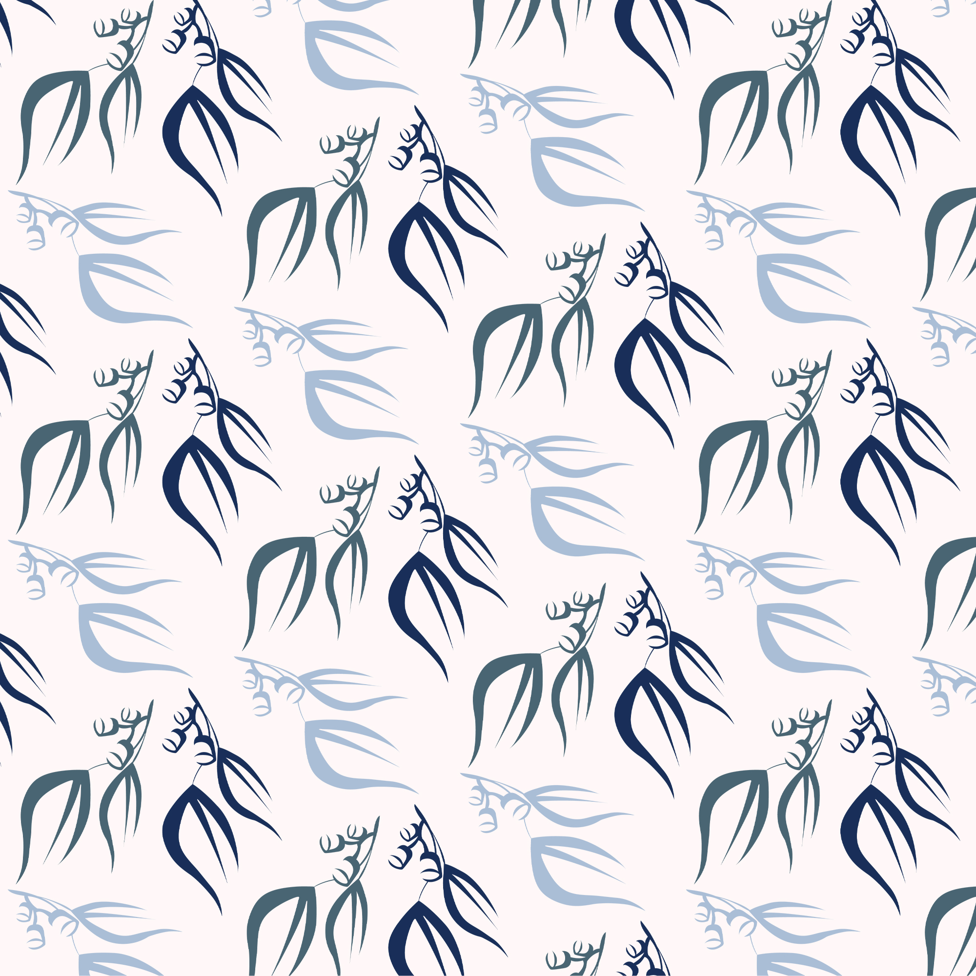
This project focused on rebranding the Blue Mountains International Hotel Management School, a Torrens University–associated institution. The goal was to create a modern and professional brand identity that still felt deeply connected to the school’s namesake region. Inspired by the eucalyptus forests of the Blue Mountains — the natural feature that gives the area its iconic blue haze — I developed a colour palette of layered blues and soft greens. The brand icon, a stylised eucalyptus leaf and seed, represents growth, regional identity, and a sense of belonging. The custom-designed lettermark and accompanying graphic elements were created to work seamlessly across digital and print formats, from formal documents to marketing materials. The final system is modern, flexible, and distinctly local.


All rights reserved. © 2025 McRae Design Studio