

The project required the development of a full brand identity for a new cheese label based in the Hunter Valley region of NSW. This included naming, brand personality, and a clear understanding of the target audience. Following the brand development, I was tasked with designing a logo, packaging concept, and creating a final print-ready packaging file.

I led the entire creative process — from brand strategy and naming through to logo development, visual language, packaging design, and final production setup. The brief called for a balance between traditional, trustworthy aesthetics and a fresh, modern personality that would appeal to contemporary, family-focused consumers.
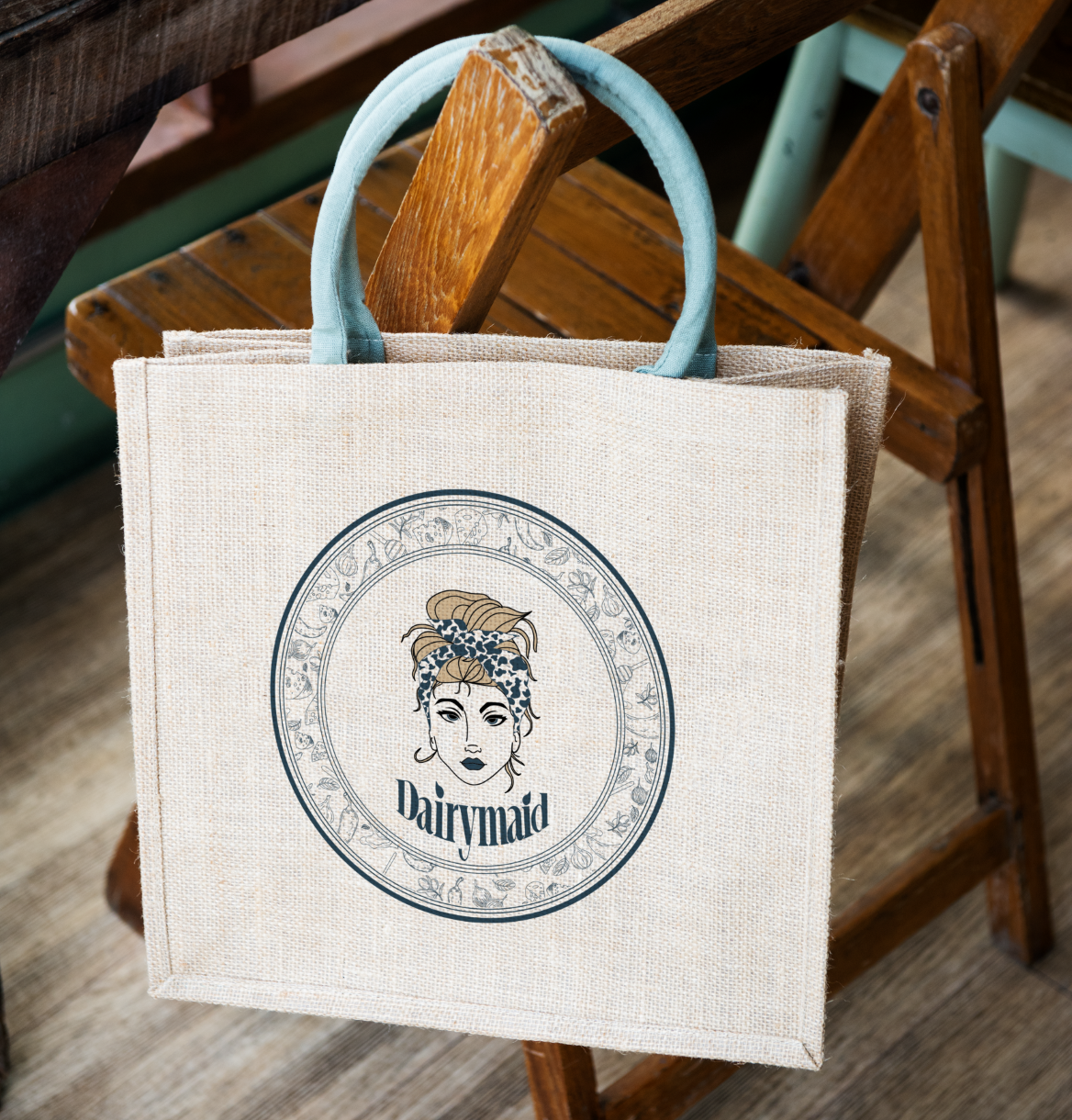
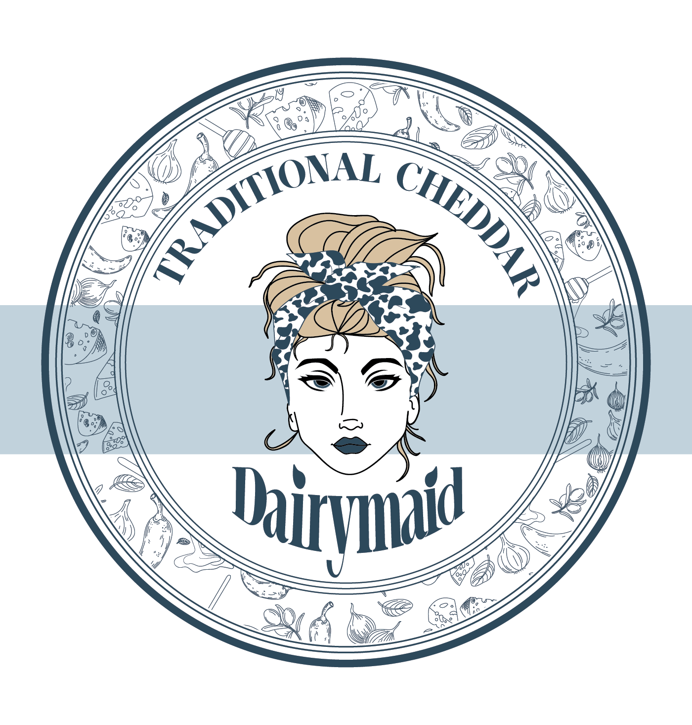
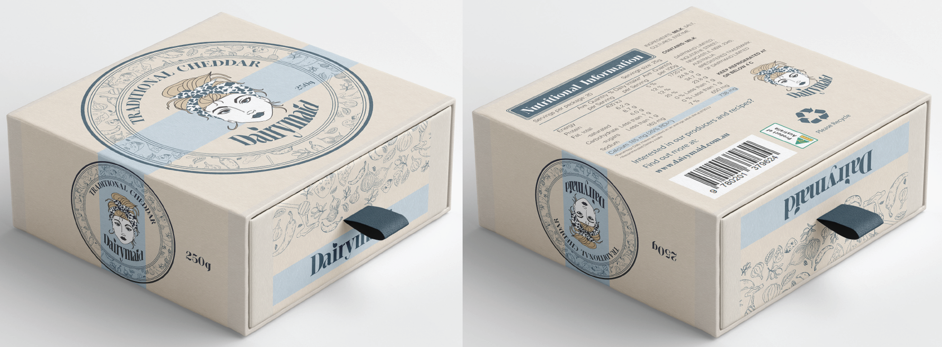
I created a warm, nostalgic brand personality under the name Dairymaid, evoking a sense of heritage and homegrown quality. The visual identity was designed to reflect this tone, featuring a classic illustration-style mascot to build brand recognition and storytelling potential. The colour palette and typographic choices mix old-world charm with modern clarity to strike the right balance.For the packaging, I developed a functional and engaging design that prioritised both user experience and shelf appeal. The box features a pull-tab drawer system containing a vacuum-sealed, resealable inner bag. This thoughtful construction allows the product to remain fresh while keeping key information — like ingredients and use-by date — visible after opening.
All rights reserved. © 2025 McRae Design Studio