

Create a double-page magazine spread using supplied text and images, along with custom design elements that pay homage to a prominent designer. The final layout needed to be print-ready and follow specific print and typesetting requirements.
I was responsible for the complete layout, typographic treatment, and visual direction of the article. This included designing a title treatment inspired by the work of Wolfgang Weingart, developing accompanying graphic elements, and ensuring the layout adhered to print production specifications.
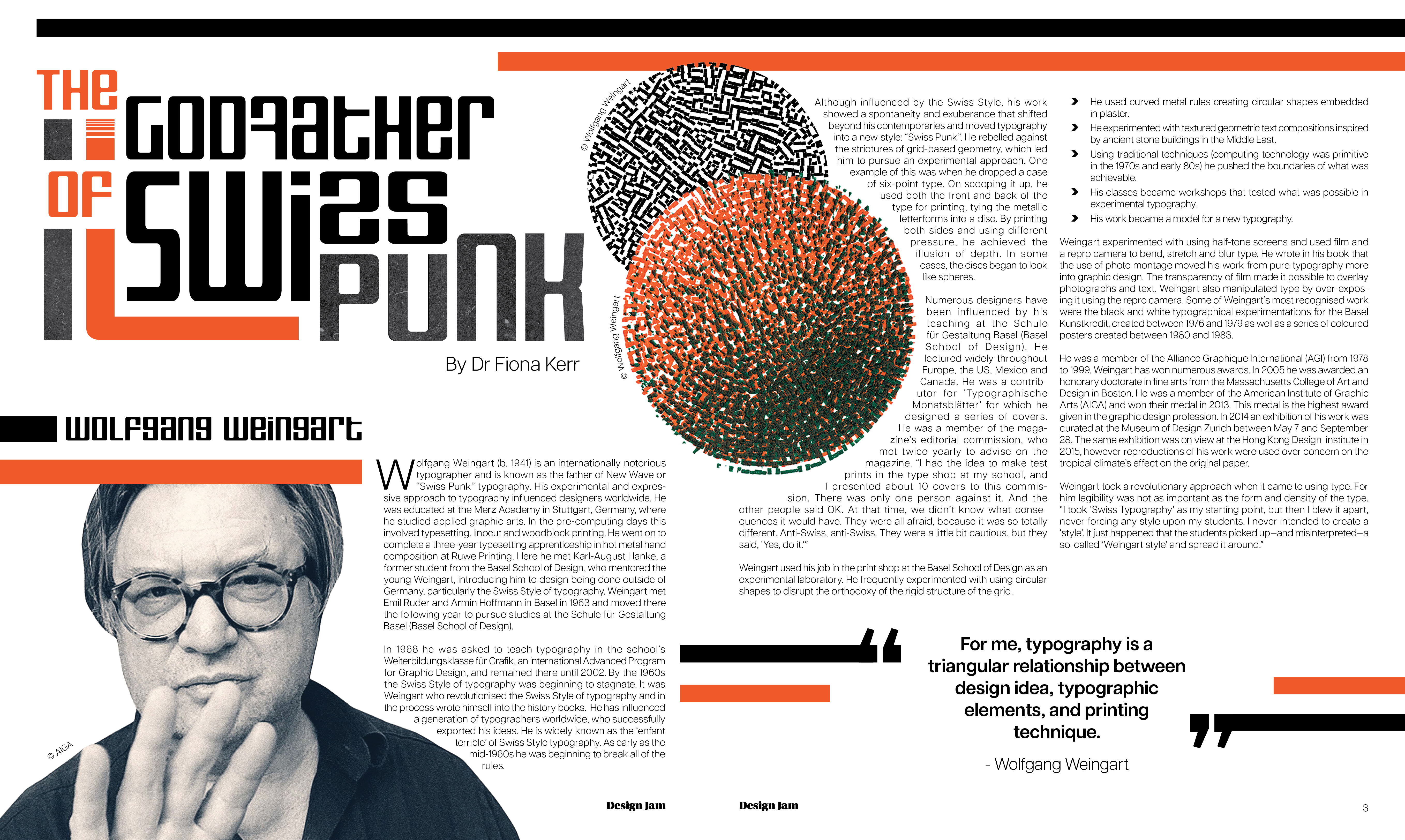
Drawing inspiration from Weingart’s distinctive style — known for its expressive, grid-defying typography and bold composition — I developed a dynamic and unconventional layout. I created a custom title graphic that referenced his experimental use of type, and carried his aesthetic principles through the use of asymmetry, layering, and deliberate disruption of traditional grid structures.The colour scheme was also drawn from Weingart’s own work, selected to reinforce the connection to his visual language while maintaining clarity and legibility for print. Supporting graphical motifs and accents were developed to complement the article content while enhancing the homage to his design legacy.

All rights reserved. © 2025 McRae Design Studio